Transamerica Brand Design
Leading the charge for visual delight
Workshop | Creative Direction

The Opportunity
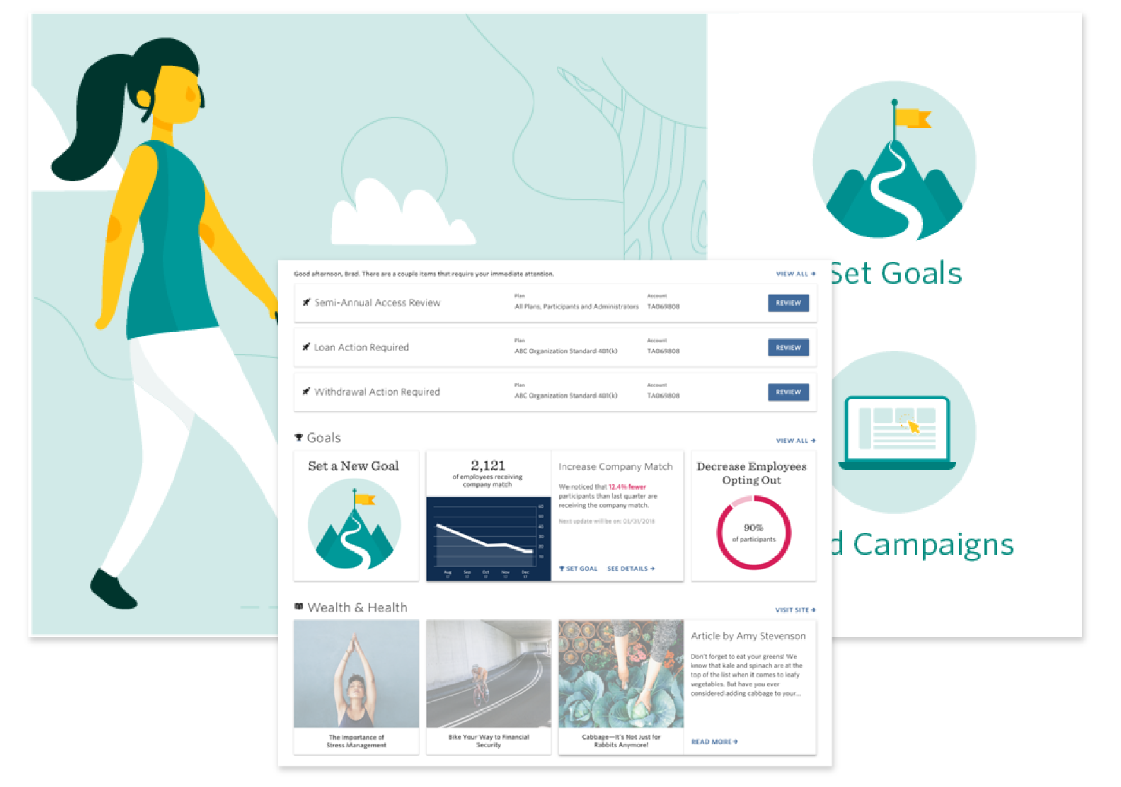
Transamerica Brand Standards did not allow for the usage of illustration. What sparked this conversation was when I was asked to design some intriguing 404 pages, but was limited to using only photography. I ventured out to present some ideas that pushed that envelope and they were ultimately rejected by Brand.
So I tried again. This time around, I put together a presentation to stakeholders to pitch the idea of adding illustration to Brand. With an overuse of photography and iconography, we were experiencing long load times for large photographs and multiple photographs on page. It was difficult to communicate more complex or abstract messaging and ideas.

The Kickoff
The background work for this initiative was some research to present to stakeholders. I pulled imagery both competitors and non-competitors to show the difference between including solely photography, and the addition of delightful illustrations. Some of the benefits I mentioned:
Abstract concepts can be visualized
Avatars and badges (Chatbot and Gamification)
Ability to animate and add expression
Surprising delight
Customization with our brand colors

Screenshots of Growmodo, a non-competitor
The Workshop
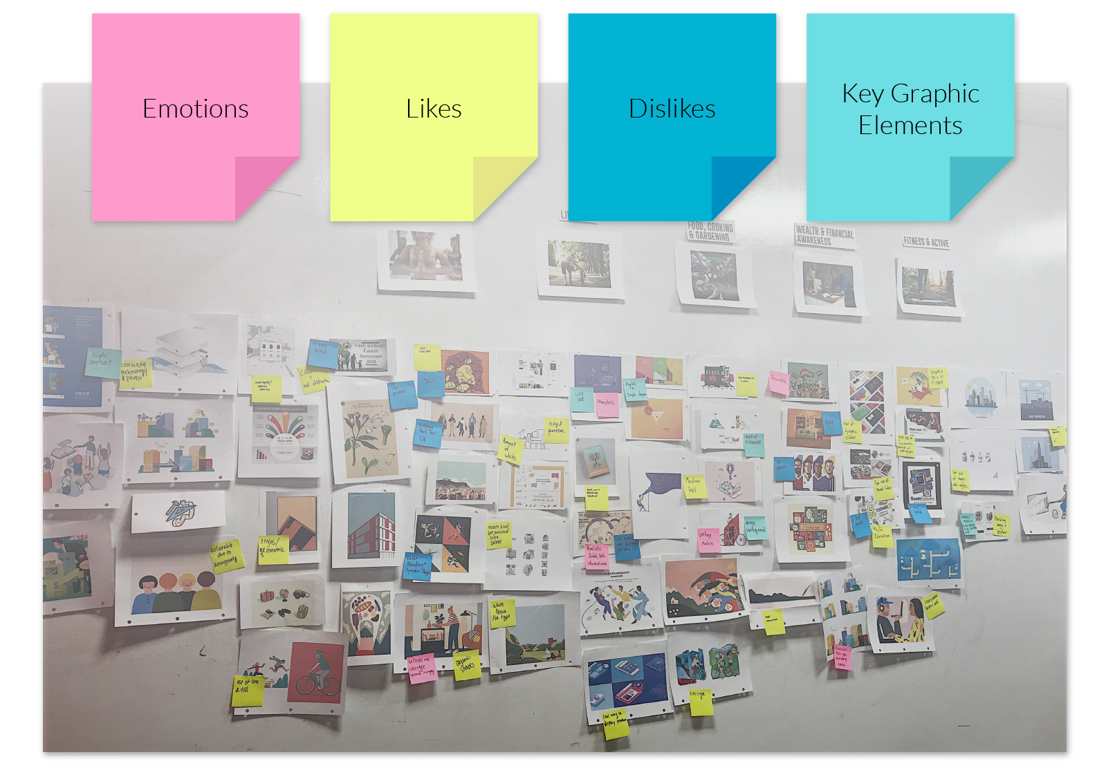
I planned and hosted a design workshop with designers from both Brand and UX to explore ideas for illustration. We explored the internet from edge to edge, printed out our favorites, and noted key elements that we would like to see incorporated into our own brand. I had them spend some time sourcing and printing illustration examples and we pinned them up on the wall under our 5 Brand themes: Mindfulness, Lifestyle, Food, Cooking, & Gardening, Wealth & Financial Awareness, Fitness & Active. We then went through a sticky exercise to categorize them as: emotion, like, dislike, and key graphic elements.
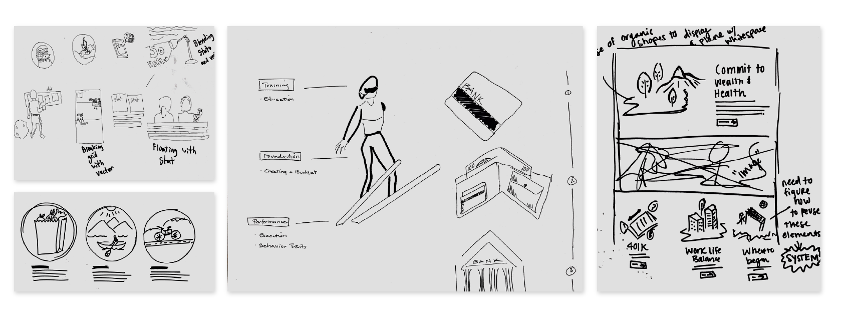
Next up, I wanted them to take some of these ideas and reimagine them to fit within our specific Brand. So everyone used these as visual inspiration to sketch their own ideas.
Next Steps
After synthesizing the workshop and bringing it back to Brand, they agreed to allow us to dedicate resources to start illustration work and see how we could fit it in Brand. We brought on UX Designer and exceptional illustrator to lead the way in concepting these illustrations. I oversaw creative direction during this time to ensure we were not only following basic brand standards and colors, but that our illustrations were unique, visually balanced, and versatile enough for our utility digital products.
The Result
After a year of work and contributions of great illustrators within the company, we ended up with a ready-to-use, customizable bank of illustrations and guidelines, open for use across Transamerica.